

- Branding
- Identity
- Visual Design
- User Research
- Wireframing
- Prototyping
- Usability Studies
- Presentations
- Personas
- User Flow
- Information Architecture
- Accessibility & Inclusivity
- Empathy-Driven Design
- Thoughtful UX Solutions
The Problem & Goal
Solving real challenges
I set out to design a solution that simplifies time management while promoting mindfulness, creating a seamless and intuitive experience to address key user pain points.
The Challenge
Busy professionals often struggle to balance work and personal life, leading to stress, missed tasks, and burnout. Existing time management apps focus heavily on productivity but often neglect mindfulness and well-being.
User Pain Points
- Users forget to take breaks and feel overwhelmed.
- Task management apps lack built-in mindfulness and focus modes.
- Users need a seamless way to switch between work, rest, and focus sessions.
Project Goal Statement
MindTime app helps users manage tasks, set reminders, and balance work and family life. It supports users like Marcus Bennett in organizing their day more efficiently for a healthier work-life balance. Effectiveness will be measured through user engagement with task management features and improvements in time allocation.
Research & Discovery
User Research
Conducted 10 user interviews and surveyed 20+ professionals to understand their struggles with time management.
Key Insights
✅ 60% of users don't take scheduled breaks, leading to burnout.
✅ 75% want a built-in focus mode to eliminate distractions.
✅ 50% forget to check tasks because of overwhelming interfaces.
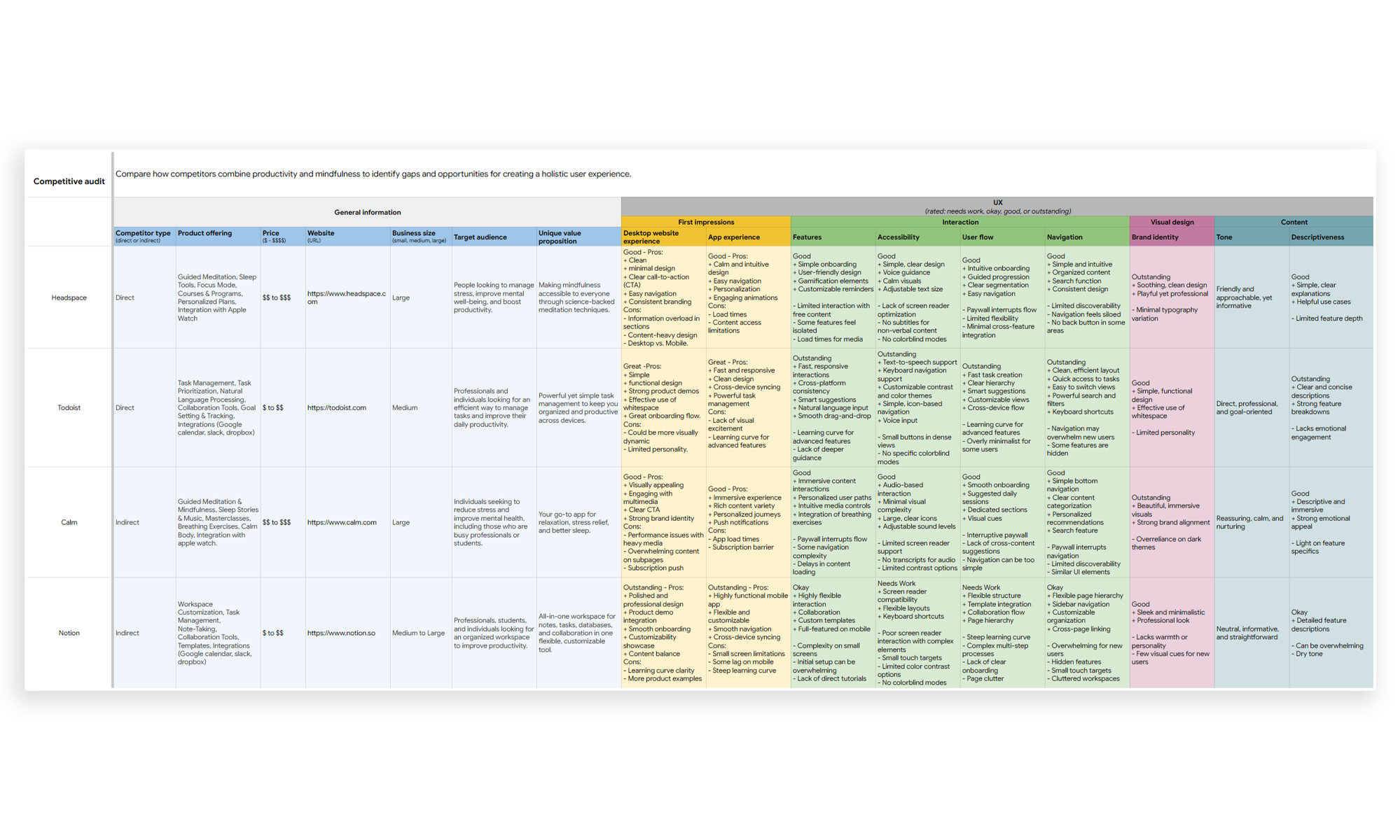
Competitive Analysis
I analyzed apps like Headspace, Todoist, Calm, and Notion to find gaps in time management and mindfulness integration.
I was able to find some gaps that we could use as opportunites to build a better app:
- Lack of seamless integration between mindfulness and productivity
- Lack of Emotionally engaging task management
- Lack of Customizable mindfulness programs
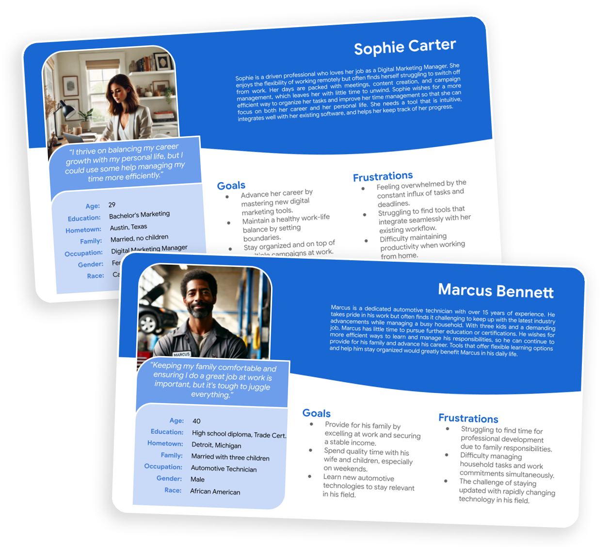
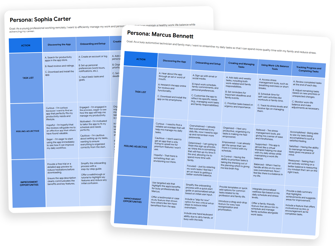
Personas & User Flows
Persona 1: Marcus Bennett – A marketing manager.
Persona 2: Sophie Carter – A freelancer
In conducting user research for the personas, I employed a mixed-methods approach, combining qualitative interviews and contextual inquiries to gather in-depth insights into the daily lives, goals, and challenges of users like Sophie Carter and Marcus Bennett. Initially, I assumed that younger professionals like Sophie would prioritize career advancement over personal well-being, and that more experienced individuals like Marcus would focus solely on family and job stability. However, through the research, I discovered that both user groups value a balance between personal and professional life, with a strong emphasis on tools and solutions that enhance their time management and reduce stress. This shift in understanding highlighted the importance of creating designs that cater not only to professional efficiency but also to personal fulfillment
Design Process
From concept to execution
Every step of the design process was focused on creating a user-centered experience—researching, iterating, and refining to ensure a seamless and intuitive solution.
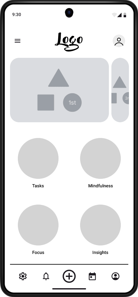
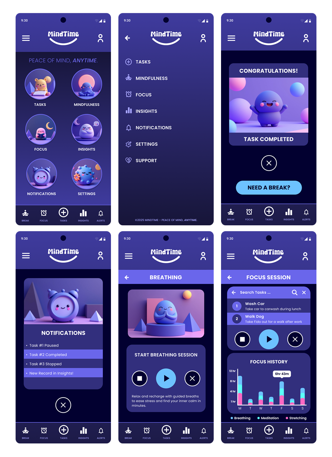
Wireframes & Ideation
Started with low-fidelity wireframes to map out the core experience.
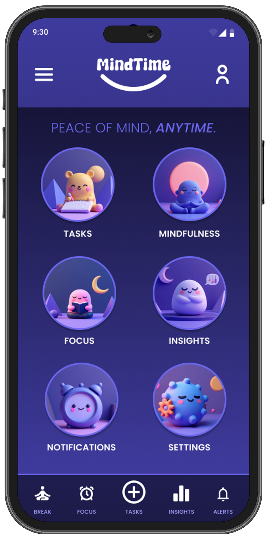
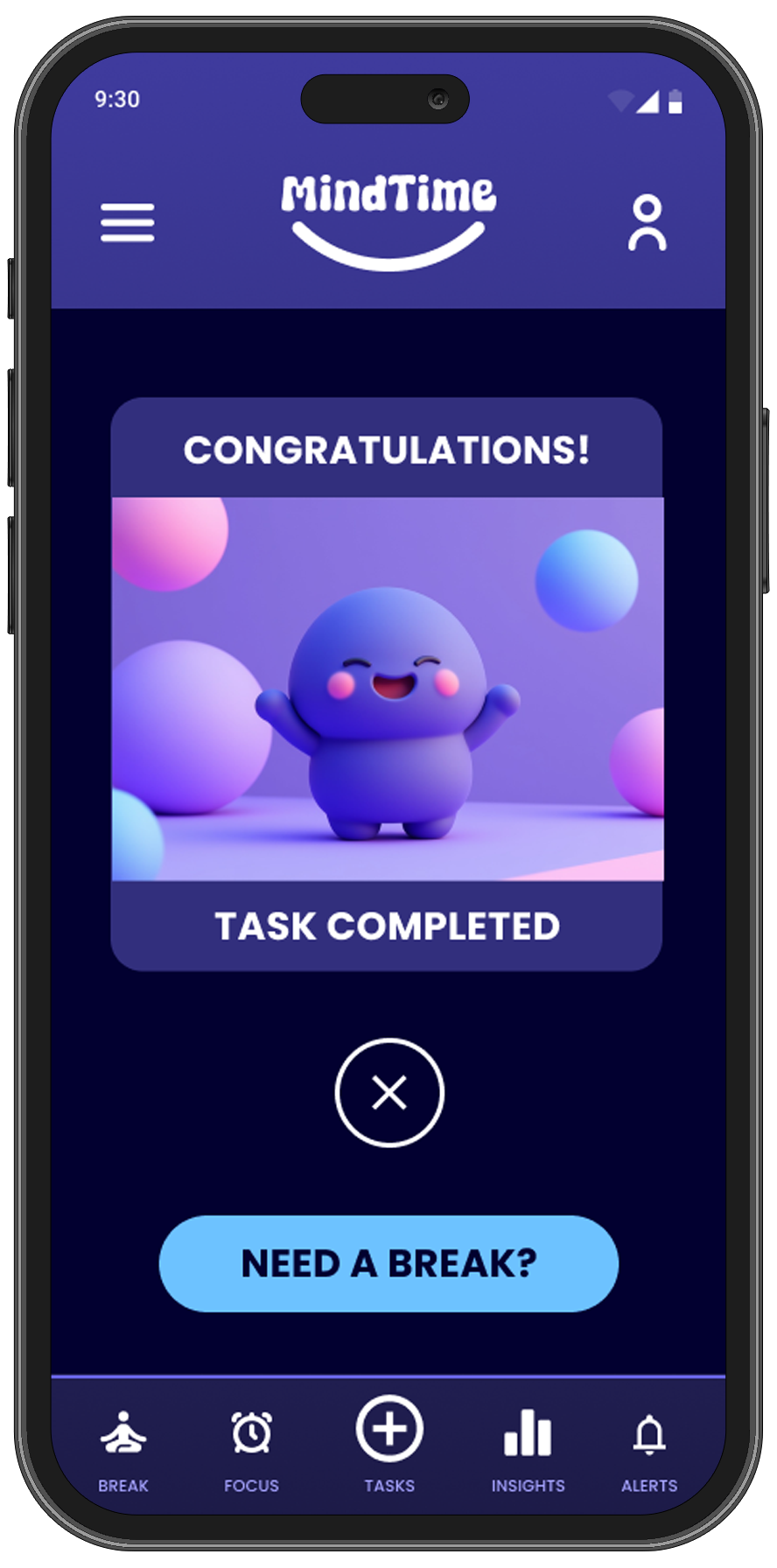
✅ Task Manager → Easily create, edit, and schedule tasks.
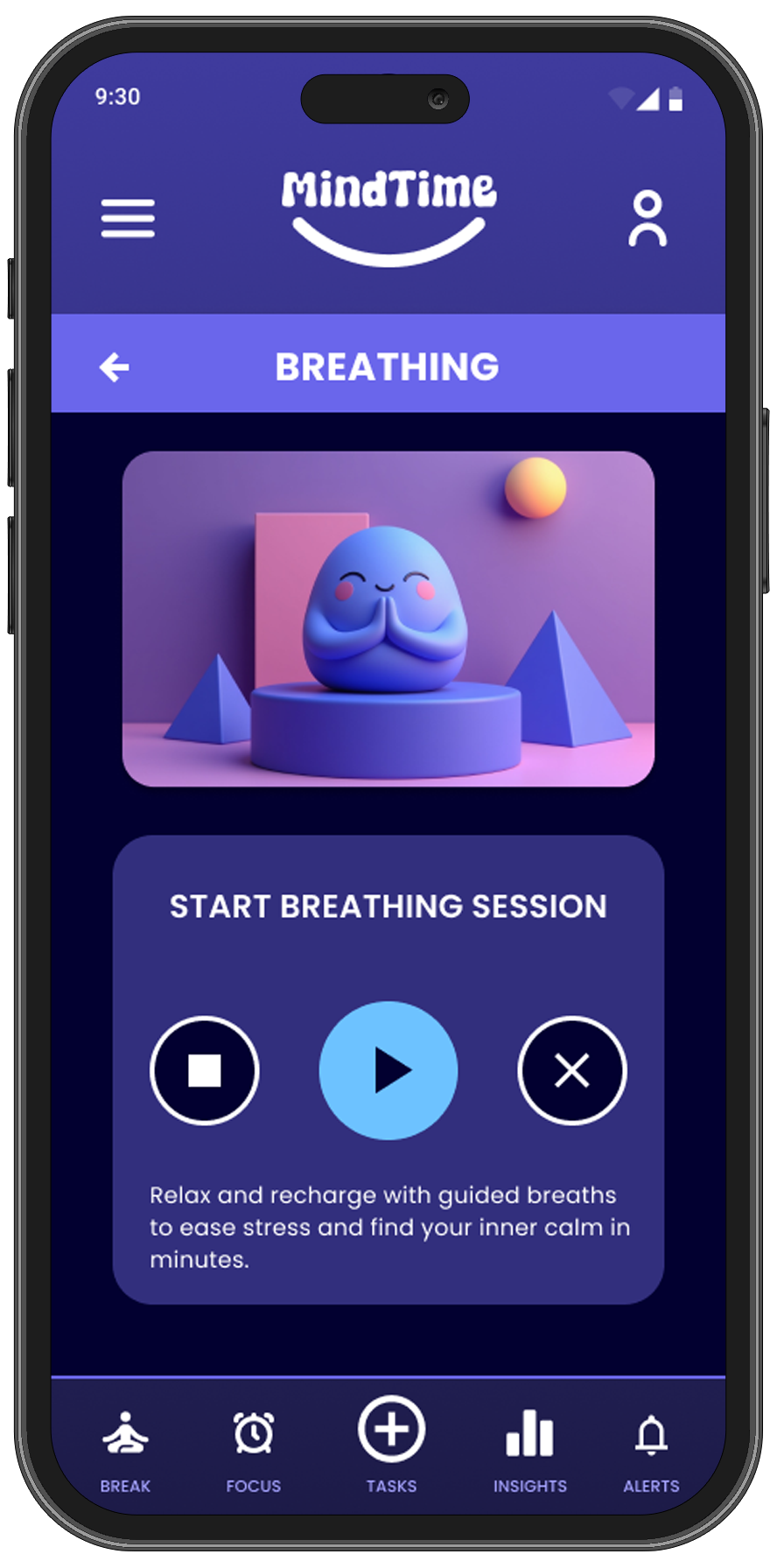
✅ Mindfulness Mode → Offers guided breathing, meditation, and stretching sessions.
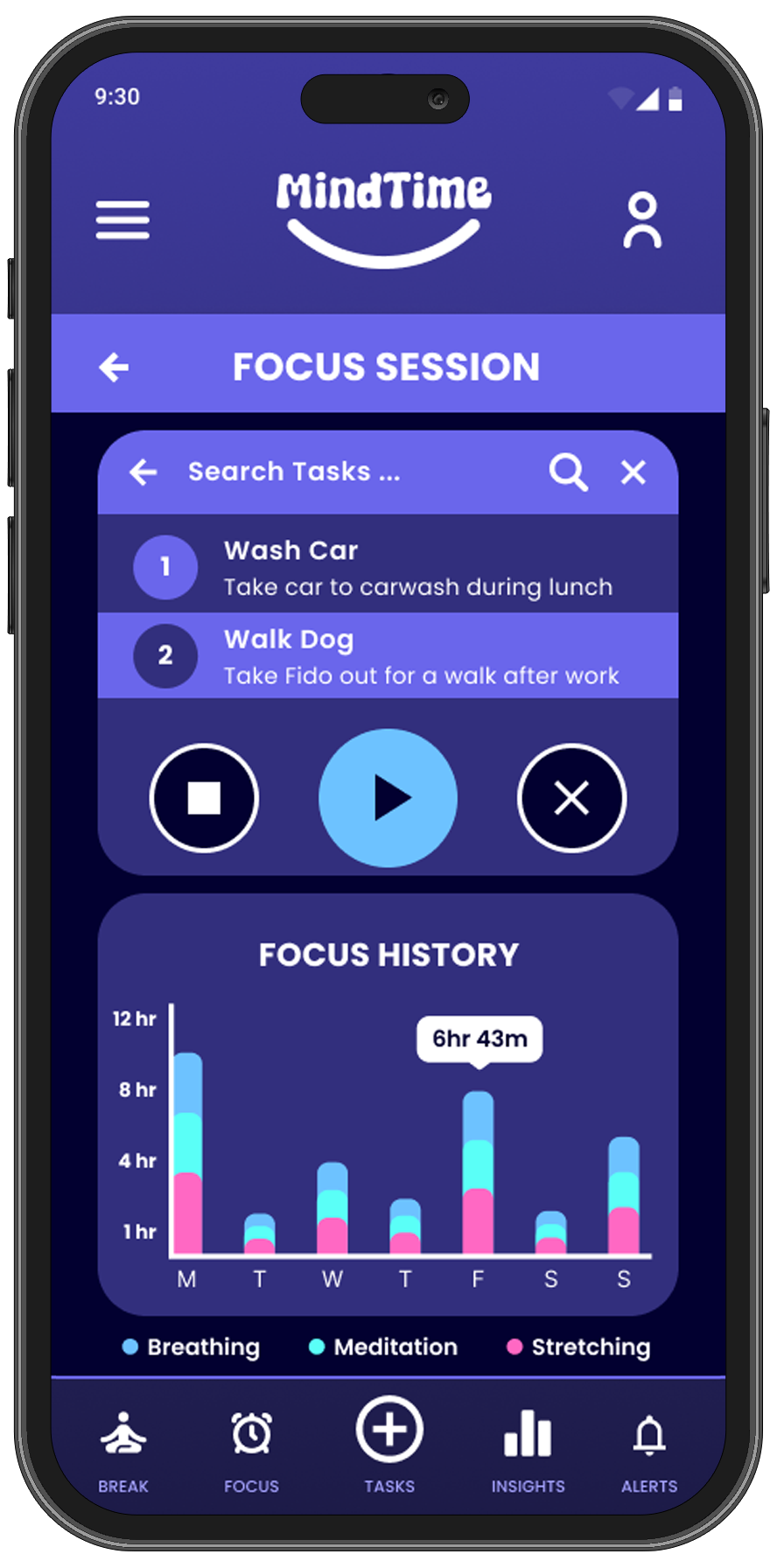
✅ Focus Mode → Silences all phone notifications and gives user timer to focus on activity.
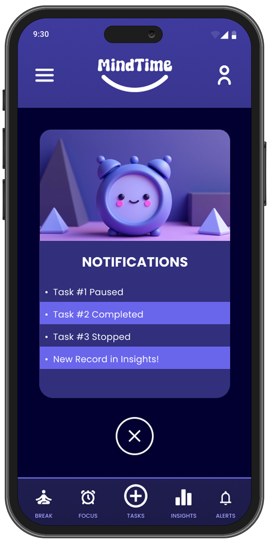
✅ Smart Reminders → Nudges users to take breaks and check completed tasks.

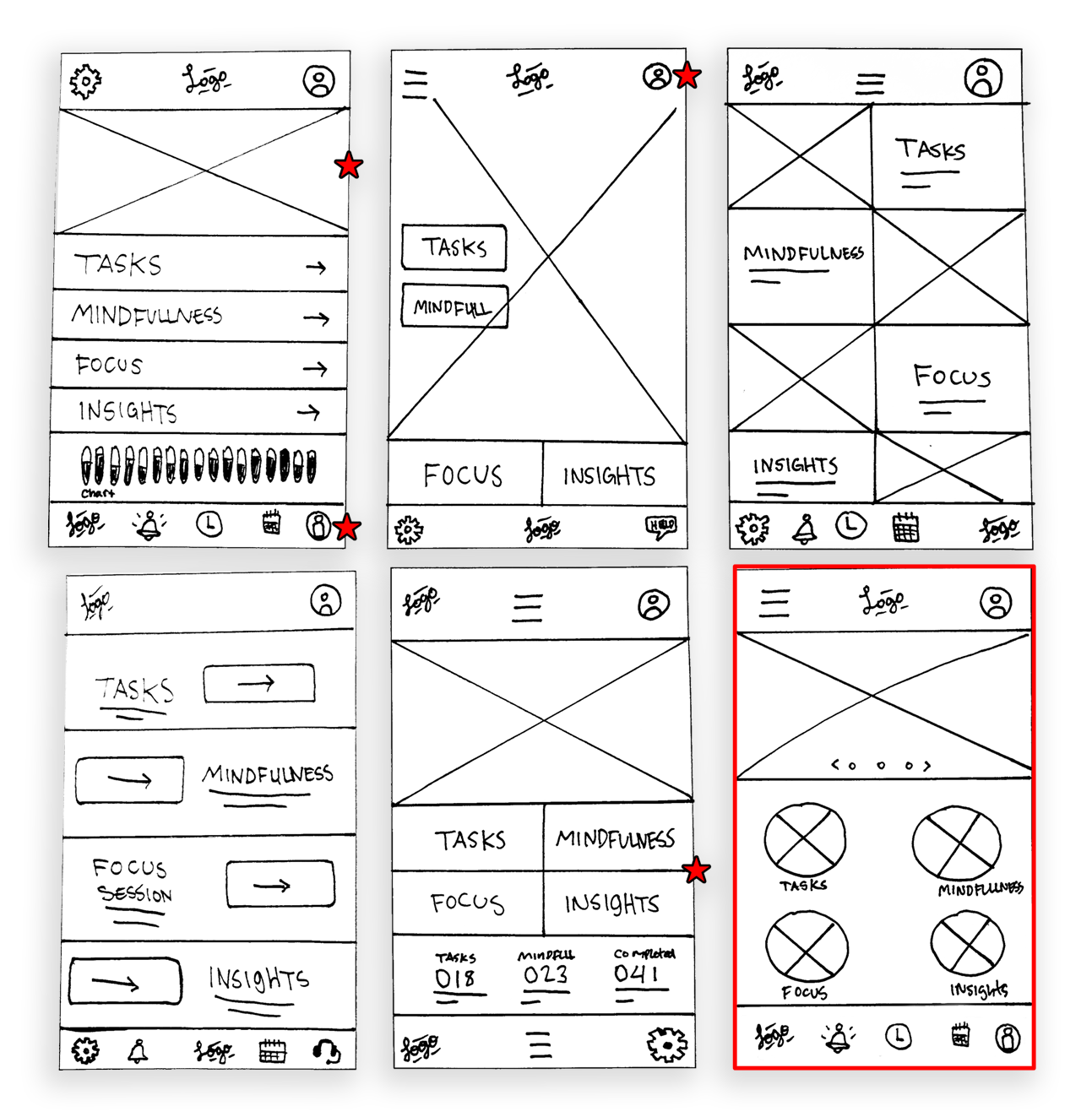
Iterations & Testing
1st Usability Test: Users found the navigation cluttered → Simplified bottom navigation.
2nd Usability Test: Accessibility Considerations → Enhanced button contrast, refined color scheme, adjusted font size and weight, and further improved navigation.
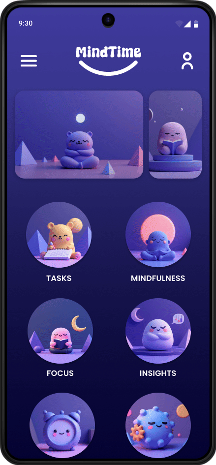
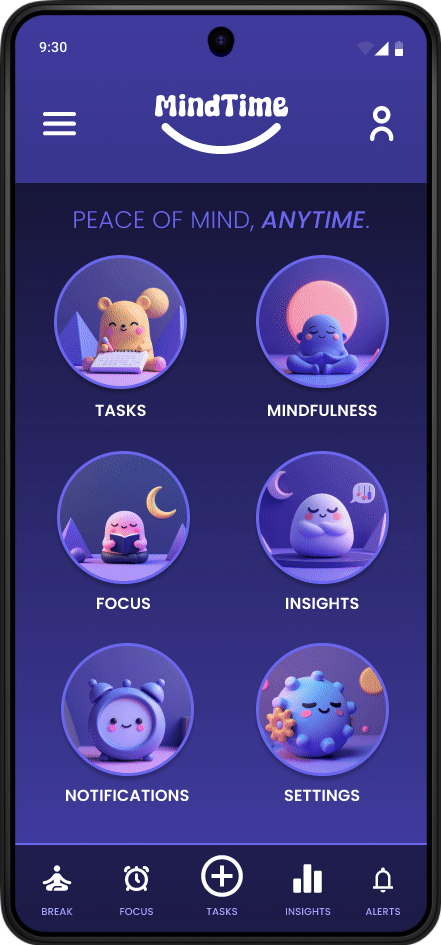
Final UI Designs
✅ Clean and minimalist interface for stress-free task management.
✅ Enhanced contrast of overall app, while keeping the original color theme.
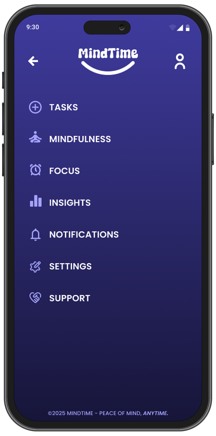
✅ Improved navigation with all necessary items being available in the app menu.
✅ Improved sticky footer navigation with the main menu items.
The Solution & Impact
Enhancing productivity and balance
The final solution empowers users to manage their time effectively while integrating mindfulness into their daily routines. By streamlining task management and promoting well-being, the design helps users achieve a healthier work-life balance.
What Changed?
Before the usability studies, the app had a cluttered design with an unnecessary header that required users to scroll and a background that blended with the icons, making it difficult for visually impaired users. After reviewing feedback, I removed the header to simplify navigation and adjusted the contrast between the background and icons for better accessibility. These changes have resulted in a cleaner, more user-friendly interface that is easier to navigate and more inclusive for all users.
Key Features & Improvements
✅ Decluttered: Removed unnecessary header elements.
✅ Accessibility: Enhanced the overall color contrast for visually impaired.
✅ Inclusivity: Adjusted the font weight and size to improve readability.
User Impact
📈 85% of users said MindTime helped them feel more in control of their time.
⏳ 40% improvement in user task completion rates.
🔔 60% of users reported that mindful reminders improved focus.
"The flow between tasks and mindfulness breaks feels natural and keeps me from feeling overwhelmed—exactly what I needed in a productivity app!"
Challenges & Learnings
Overcoming obstacles and refining the experience
Throughout the design process, I encountered challenges in balancing simplicity with functionality. User feedback and iterative testing played a crucial role in refining the experience, ensuring the final product met both usability and accessibility needs.
Challenges Faced
🚧 Users found early navigation confusing → Refined layout for a smoother experience.
🚧 Integrating mindfulness without disrupting productivity was tricky → Balanced both with seamless transitions.
🚧 Users ignored reminders → Converted them into notifications with alerts to increase engagement.
What I Learned
Throughout the MindTime project, I learned the importance of balancing functionality with simplicity. By focusing on user needs and incorporating mindfulness into the app's design, I gained valuable insight into how small design choices can greatly impact user well-being. Additionally, the feedback from peers and testing helped me iterate on designs to create a more seamless and intuitive user experience. This project reinforced the value of user-centered design and continuous testing to improve overall satisfaction.
Next Steps
Future Improvements
Add collaborative task sharing for teams.
Introduce AI-powered smart reminders based on usage patterns.
Expand to desktop & smartwatch integration.
Final Thoughts
Reflection
MindTime successfully blends task management with mindfulness, filling a gap in traditional productivity apps. By focusing on user needs, I created an intuitive, stress-free experience that promotes better work-life balance.
"MindTime makes it so easy to stay productive without feeling overwhelmed! The focus timer combined with task management has completely changed how I work."